


Beth & Matt Wedding Stationery
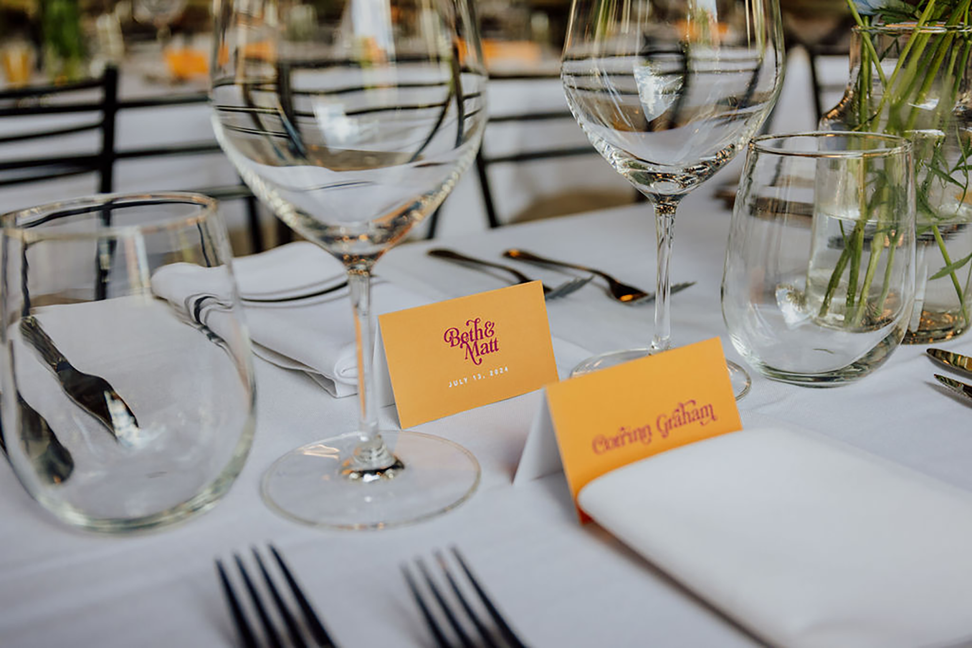
Beth and Matt wanted wedding invitations that differed from the usual florals or formal style. They wanted something fun and that represented them as a couple. I focused on their names and a bright colour scheme that matches their bubbly personalities. The couple loved the wordmark for their name, and the typographic style was carried through the rest of the printed materials for their wedding; from the invitation to the seating chart and place cards. I typeset each guest’s name on their place cards, to match the feel of the couple’s names.
Photography by: Christina W. Kroeker Creative